
jeffrey equality brooks - an uncomfortable conversation
116 gallery
116 West Main Street, St Charles, IL
Opening Reception: Saturday, March 12th, 2022, 6-9pm
Runs March 9th - April 3rd
contemporary figurative paintings featuring stencils, sprayed automotive paints, broken glass, sand, resin, enamel, vinyl, metal flake, 3D elements, flocking, 24k gold, silver, and copper leaf
I’m thrilled to bring this body of work to 116 Gallery in St Charles, IL in a solo show. This body of paintings includes pieces that I’ve been working on for the last three years. Those that haven’t seen my paintings might be bewildered to hear that they are mostly built up from spraying automotive paints with mega-detailed cut one-time use stencils. And in this work you’ll also see paint mixed with silica, 24k gold and copper leaf, broken glass, cut and layered strips of transparent vinyl, brushed enamel, stacks of resin, and of course you’ll see my obvious love affair with hot rod paints with oodles of metal flakes and candied paints. You can click into any of these images to get more info about materials or sizes as well as more detailed photos and to purchase.
Before i show you this work i’d like to say in short my goal is to produce compulsively “lookable” paintings that make you say “shit i’ve felt like that.” My work at its core has this goal, and sometimes it might be an uncomfortable conversation.


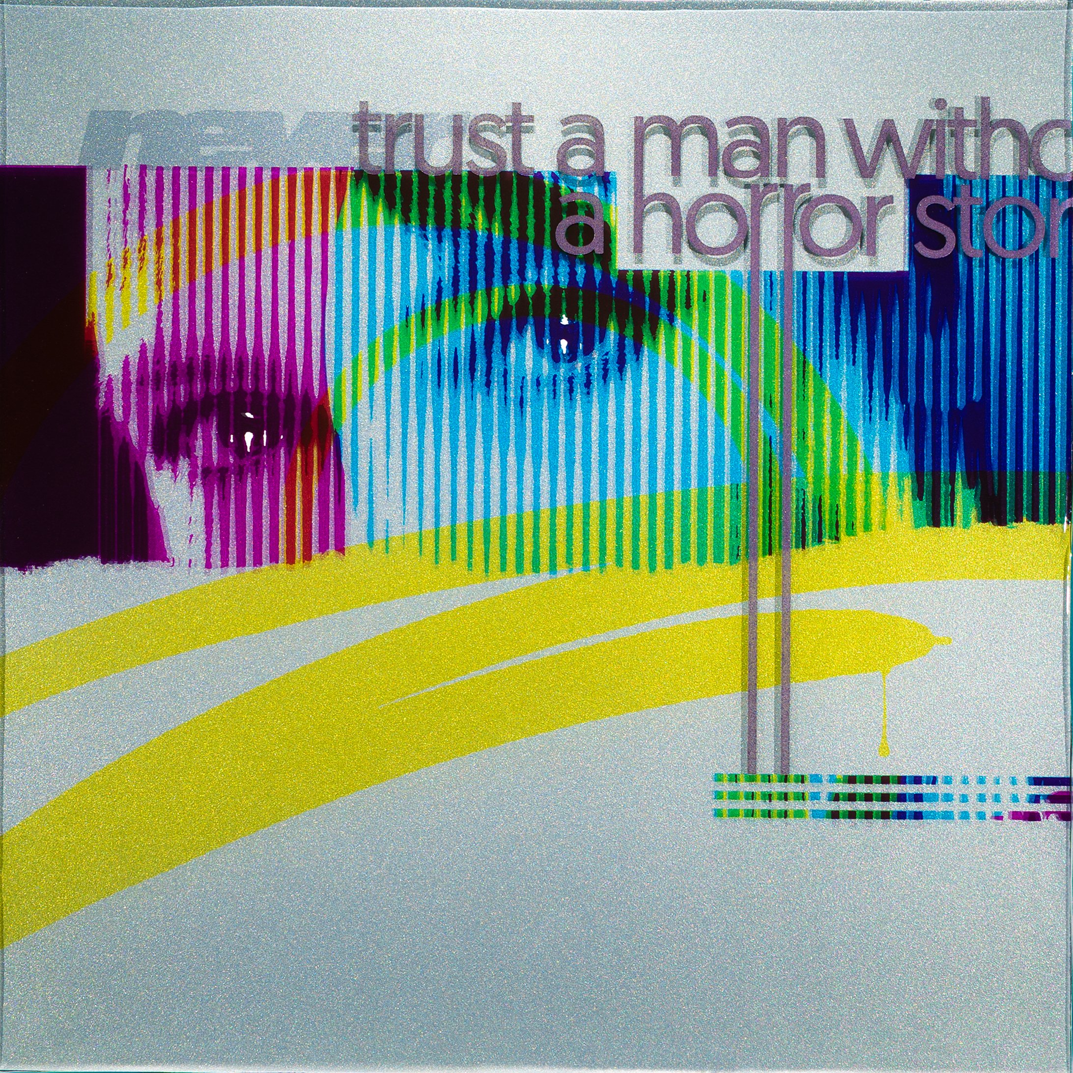
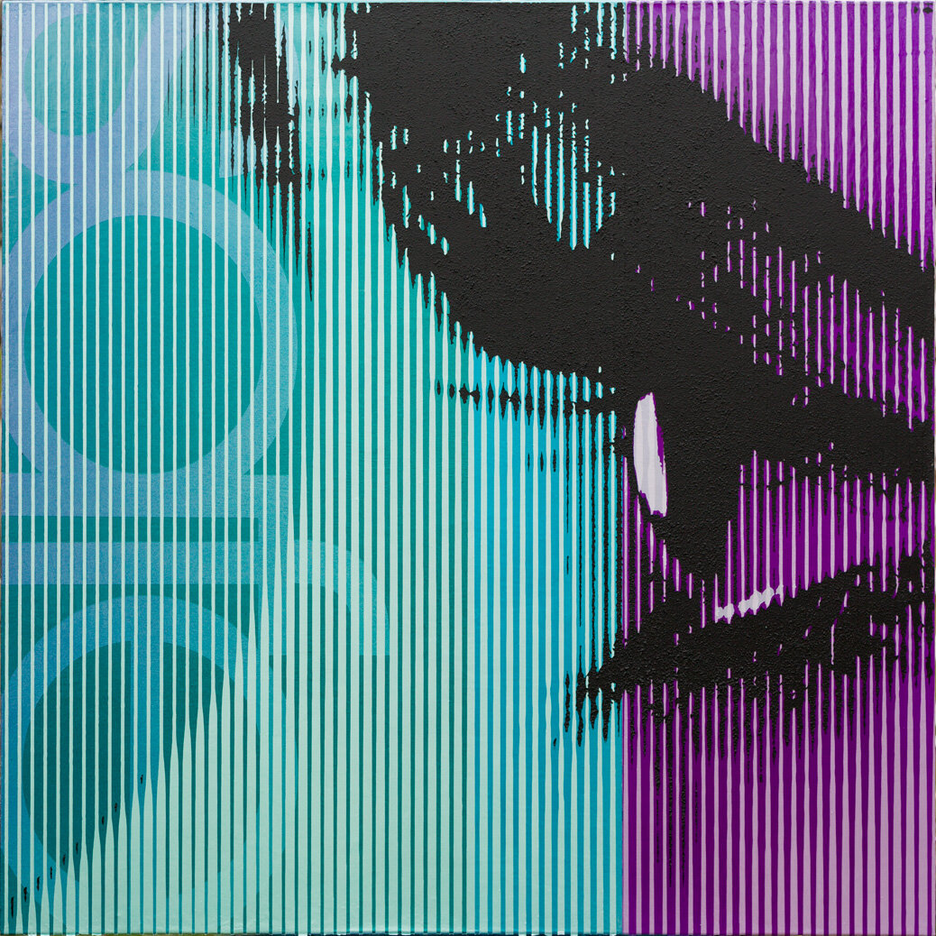
These three are the start of a new series and are 24x24x2.5 inches on cradled aluminum. They are built off a pearled and aluminum paint base that was hit with a metal flake. Subsequent layers’ color are either cut strips of transparent vinyl or “candies” (as folks in the auto paint world call these special transparent paints ). Each Layer of paint or vinyl is then stacked between another layer of thick poured resin. If you click into “ghost-in-the-machine” (link) there is video showing part of my unique process i created to make these pieces
The goal of these pieces it to discuss how vantage point and perspective relate to understanding.
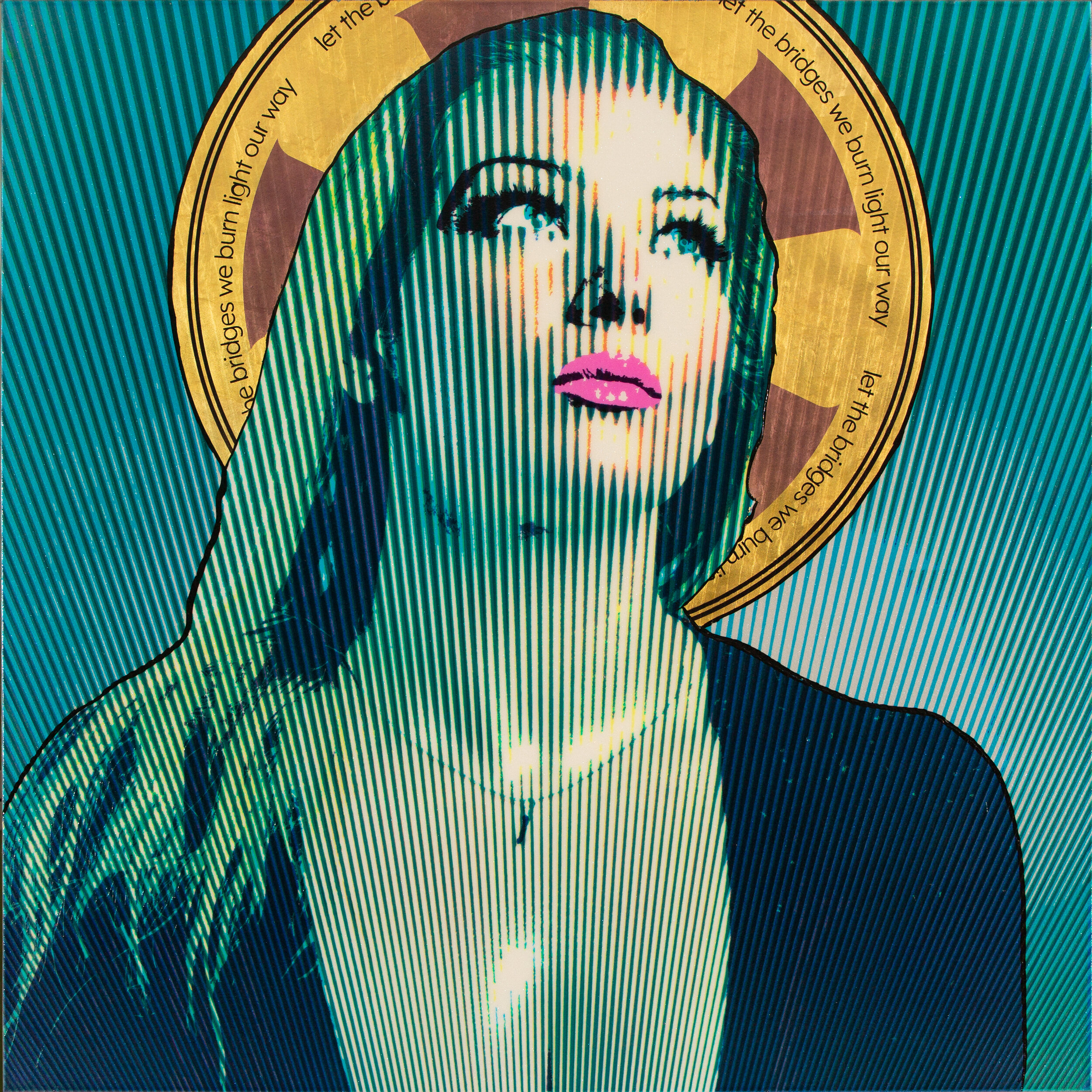
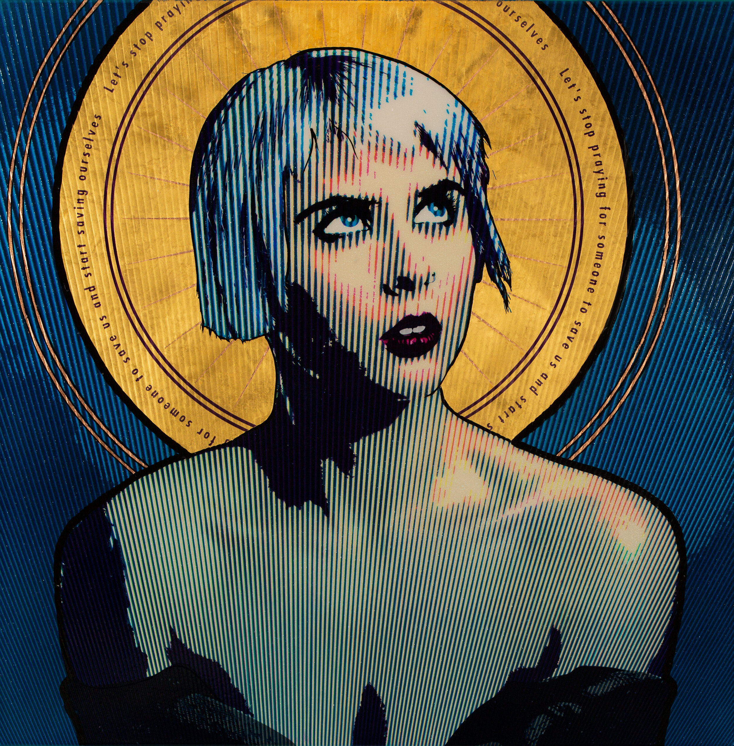

These are three of the five created for this series and are 40x40x1.5 inches on stretched canvas. This series is built off a pearled and aluminum paint base that was hit with a metal flake. Subsequent layers (oh, which there are a ton of) are transparent or “candies” this again affords the viewer a chance to peer into the paint to see the sparkle below. Halos are 24k gold and copper, then the pieces are finished off with an automotive clear coat, which I think looks awesome, but it’s pretty hard to photograph. Here (link) is a super small video of how I made that painting.
The topic of the paintings in my halo series focuses on the difficult necessity of active choice when moving from generational beliefs and traditions. All the while, completely acknowledging that I’m relying on arcane visual language to add gravitas.
LOST + safe are 40x40x1.5 inch paintings on stretched canvas. These words have a draw for me and I have liked them paired since I heard a CD of this title. These have a super subtle flake to them and are built on a ground coat of pearls. The “blacks” are a flat finish but have silica mixed into them that give a really exciting (at least to me ) lifted texture to such a flat graphic part of the paintings.
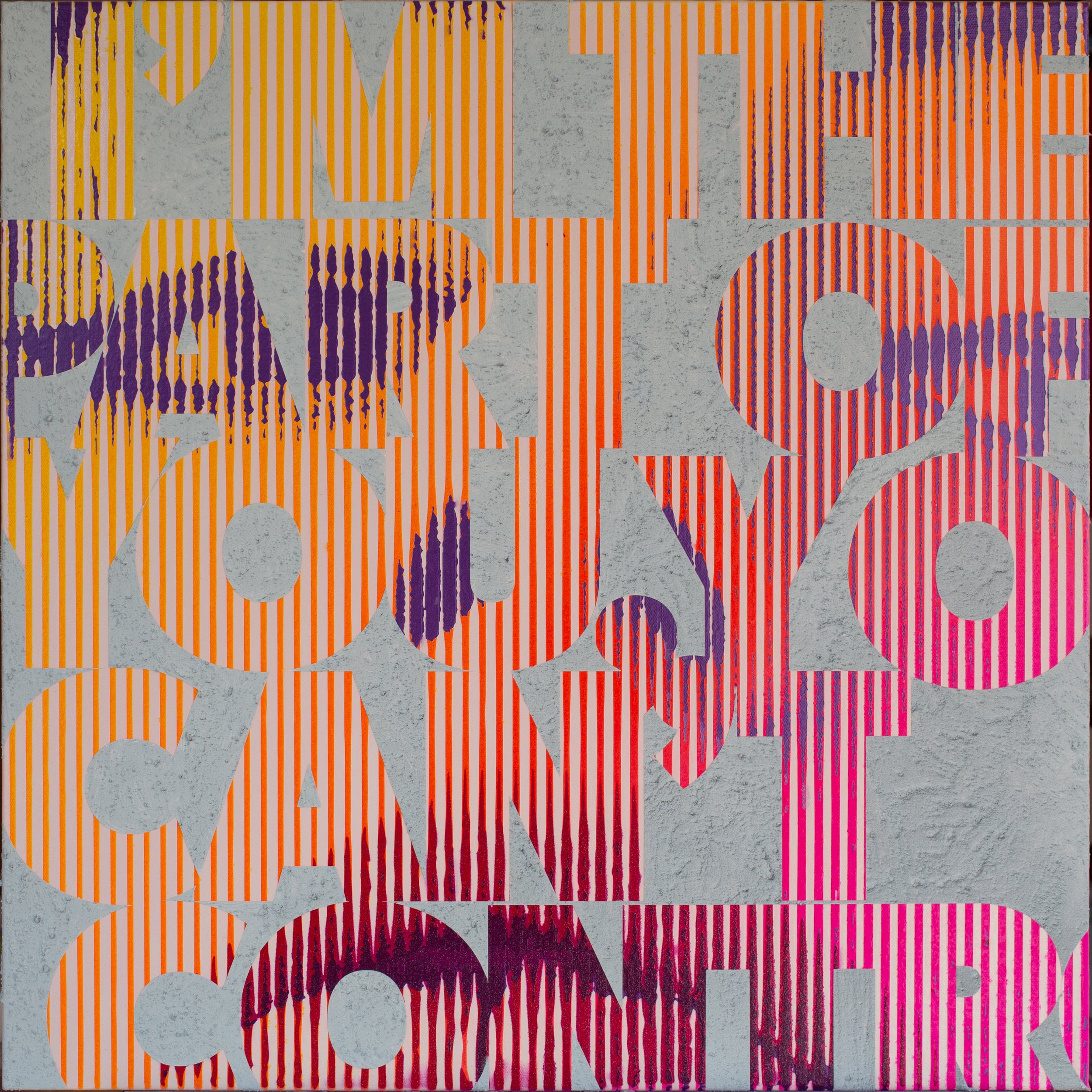
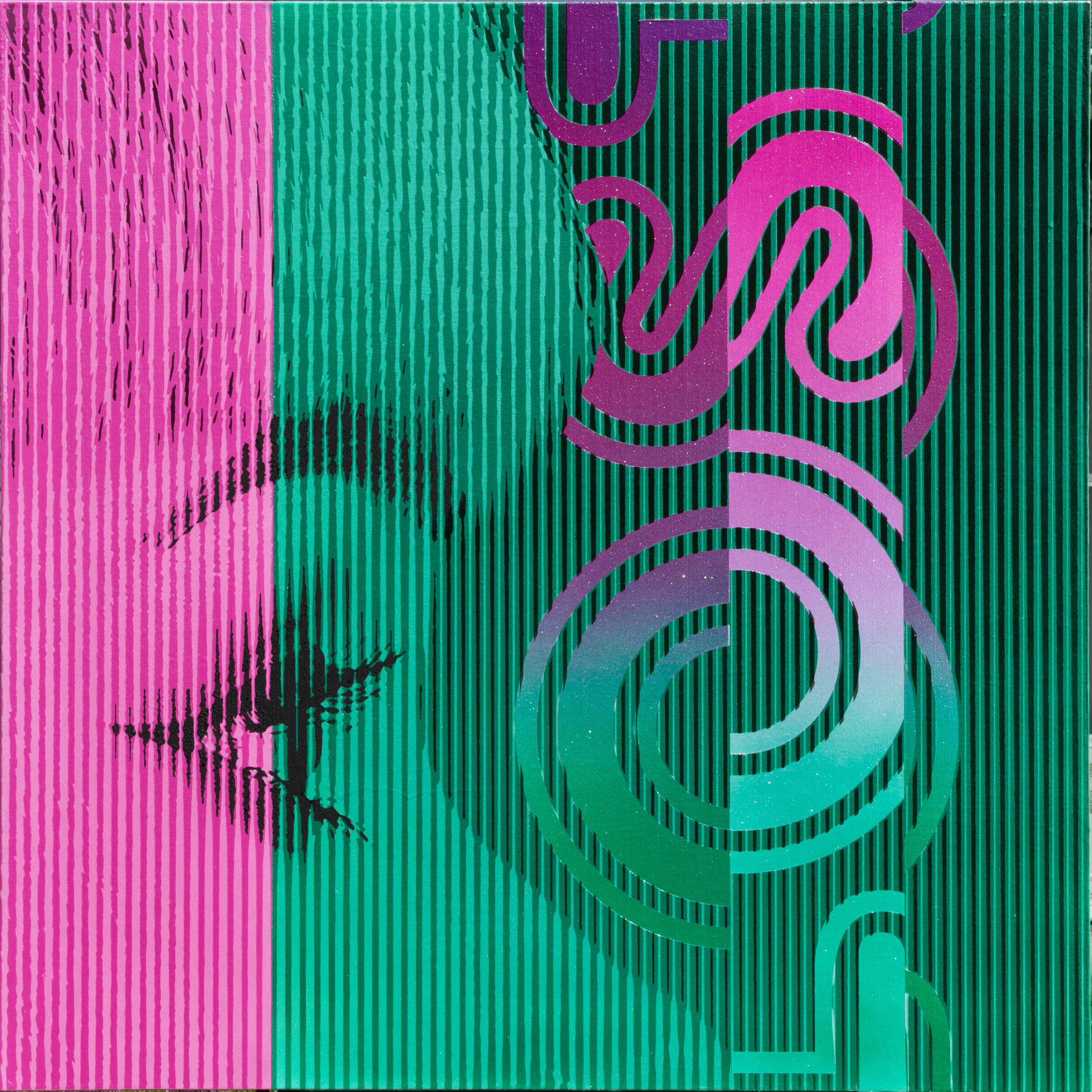
This series of 24x24 inch paintings is playing with two-color reductions, in this rule of simplification I was able to try some pretty fun and rich materials.
Stacey: is built on a glossy aluminum base paint with a simple matte purple.
I’M THE PART OF YOU, YOU CANT CONTROL: For this one i sprayed a gradient splitting the composition diagonally, then layed in the darkest features in a royal purple, this painting also employs silica in the background grey color that gives massive texture .

In this set i was focused on moving my palette away from “true to life skin tones” while still keeping the number of colors somewhat reduced. Topically, in simplest terms, these have a focus on how we deal with social expectations. (all are 24”x24” stretched canvas)
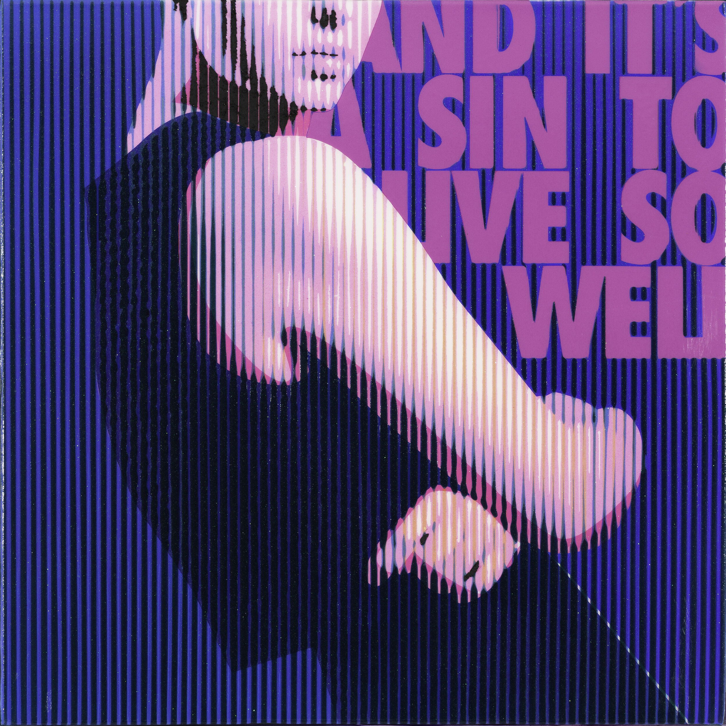
AND IT'S A SIN TO LIVE SO WELL: is building on the idea of flakes and opaques back and forth.
can we admit some lies we've told each other: this is a canvas version of a painting that is currently being shown in the Tokyo Metropolitan Museum Of Art . Built off a silver base then layered with pearled, metal flake, and candied automotive paints. It’s topped with a flat black and silica-laden layer that gives textures that you want to touch so badly.
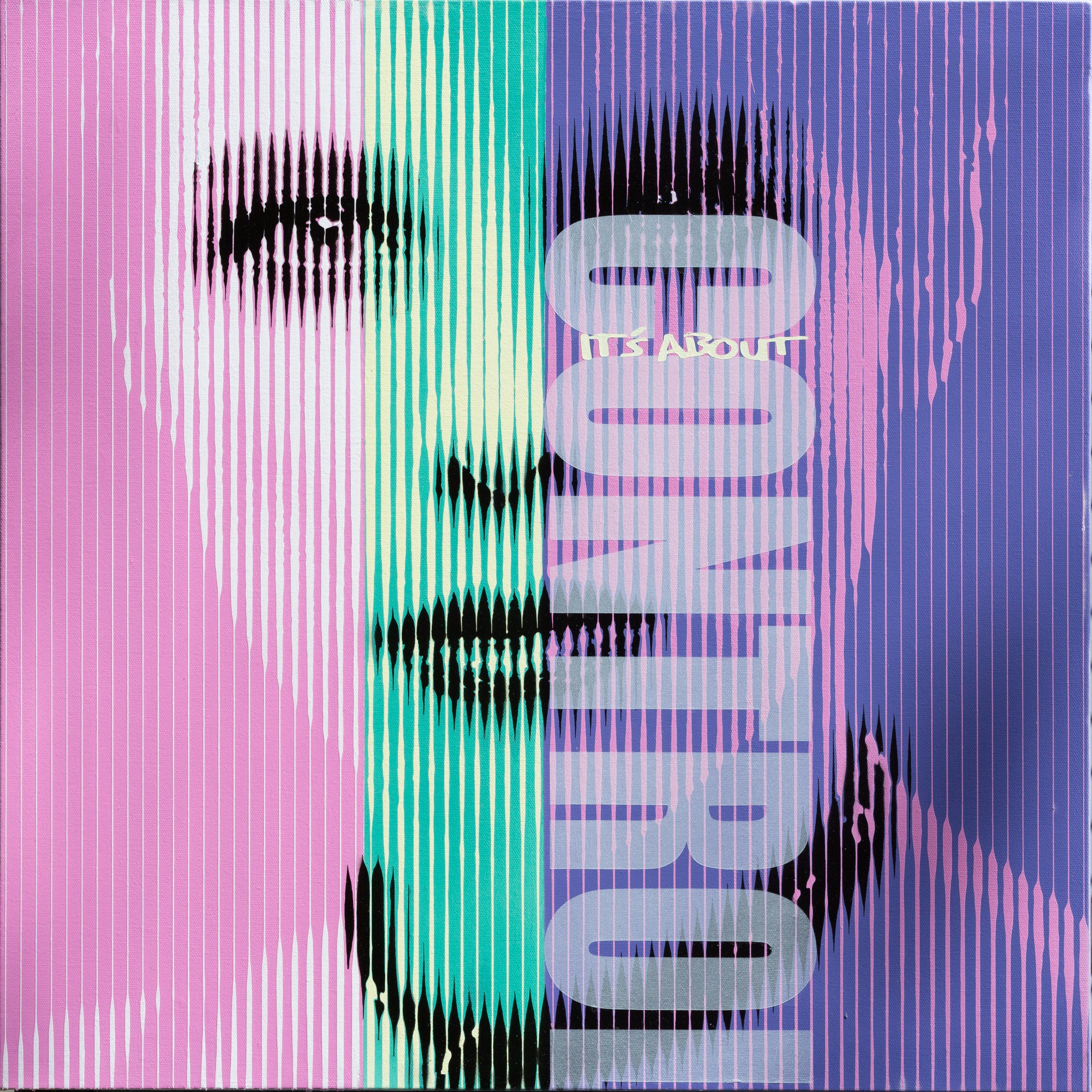
It’s about control: also features a reduced palette and a strong focus on verticals .
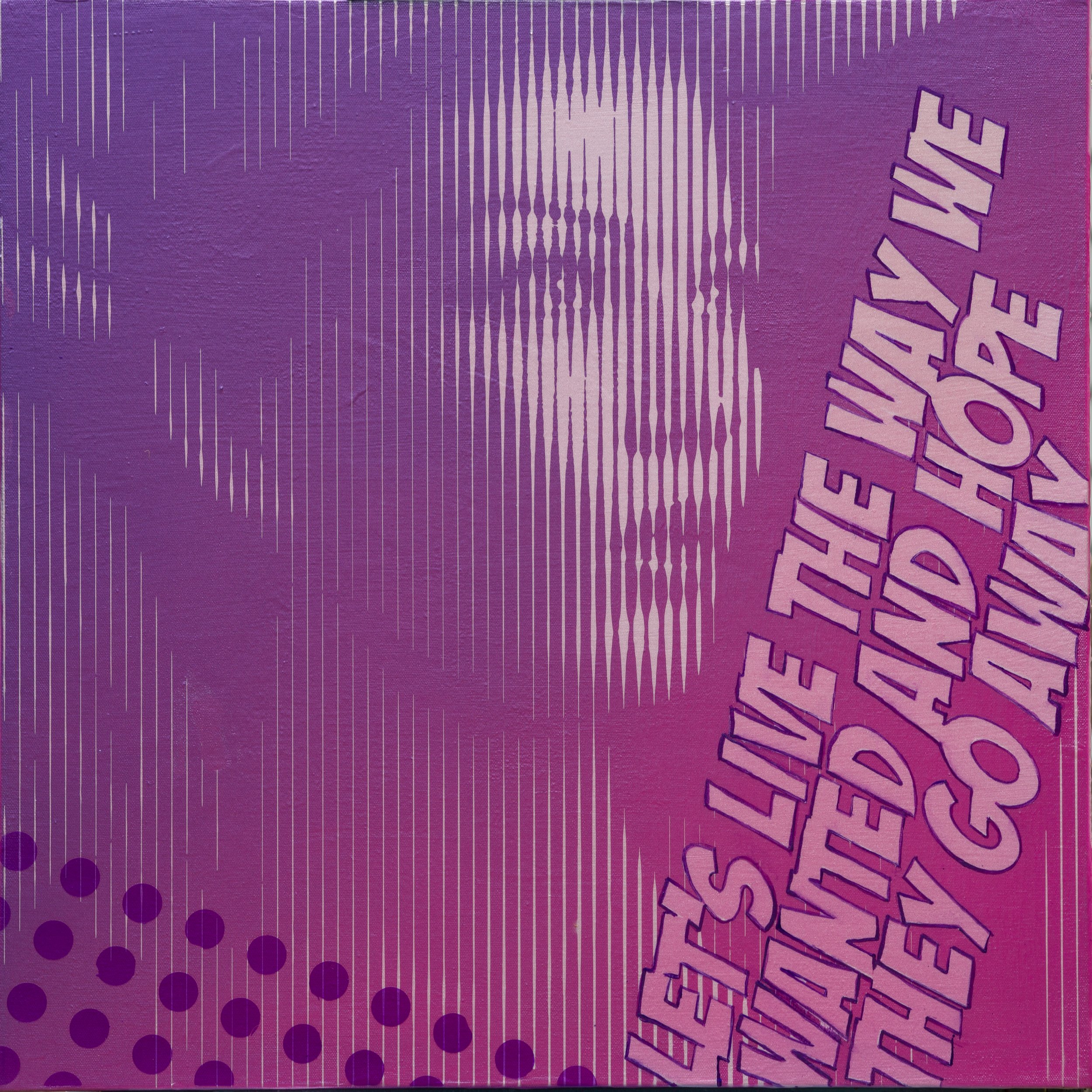
LETS LIVE THE WAY WE WANT AND HOPE THEY GO AWAY: Features a wonderful pearled gradient and experiments with pattern.
I like these two piece next to each other, there is a kind of head tilt and supple expression they share that exudes an honesty that only comes from an unguarded moment. Its the moment between poses, between hardening our look and putting on our city face that is where magic and connection happens. The text lets you in as i focus again on the feeling we all have but rarely discuss in this world; big mouth and no hearts. (both are 24”x24” on stretched canvas)
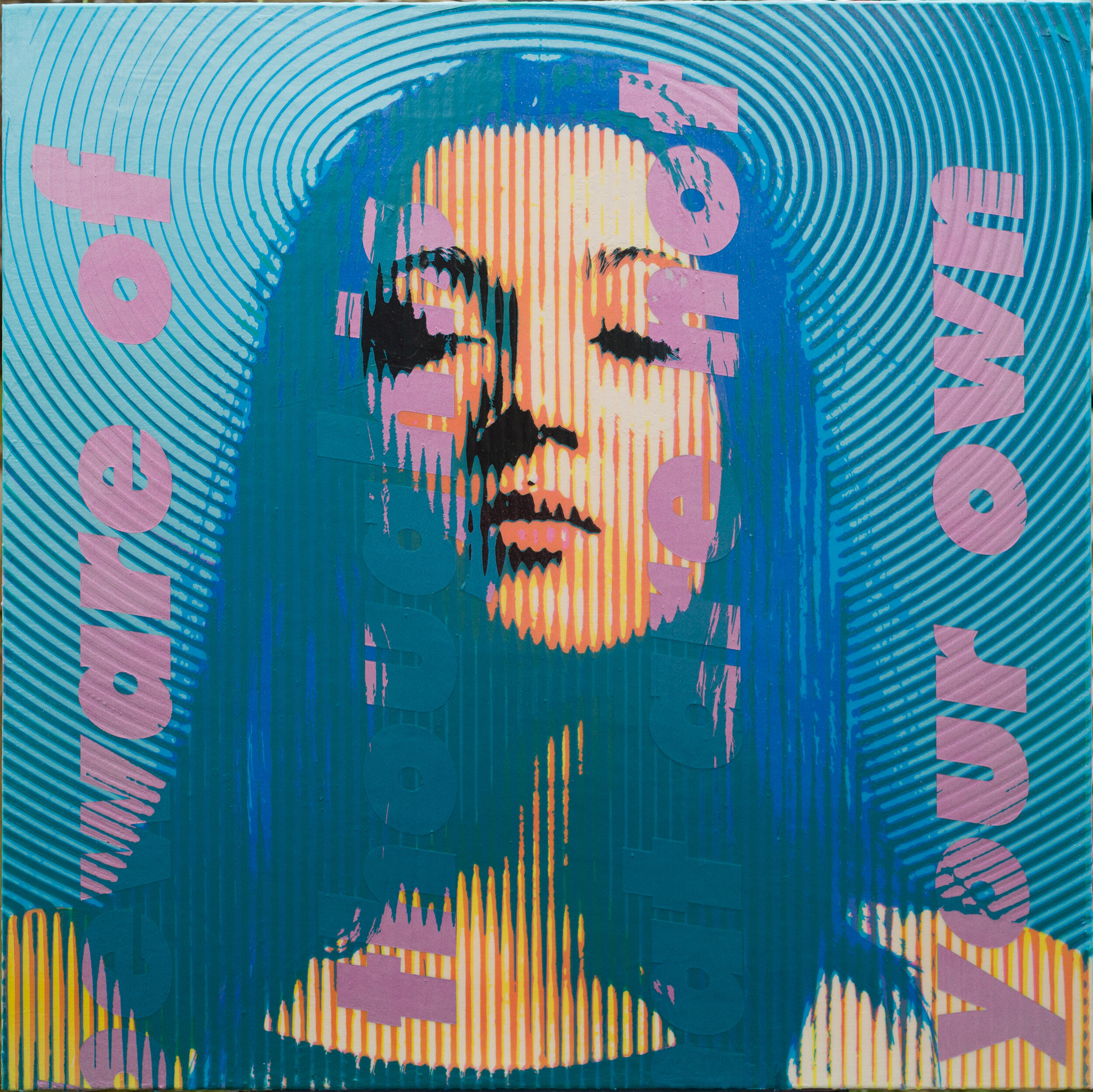
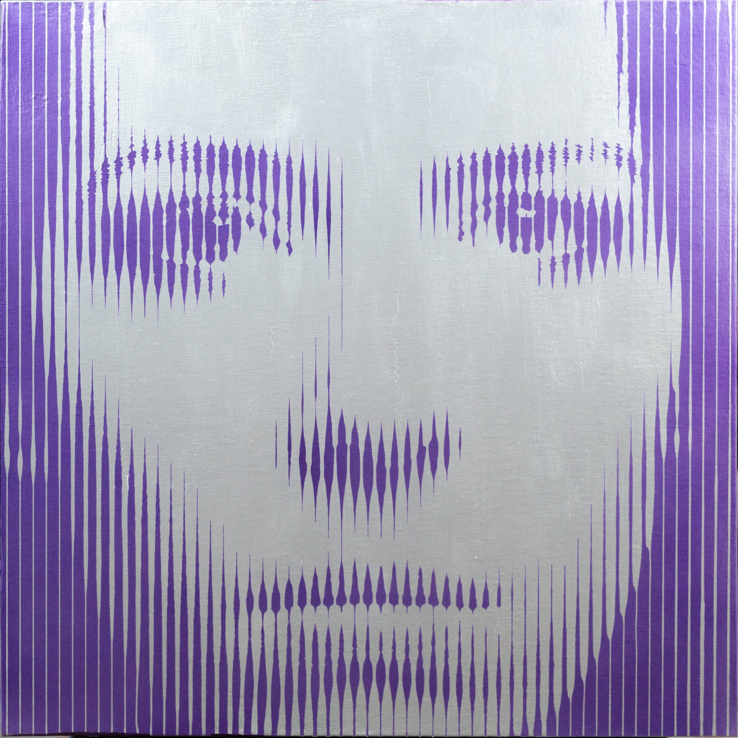
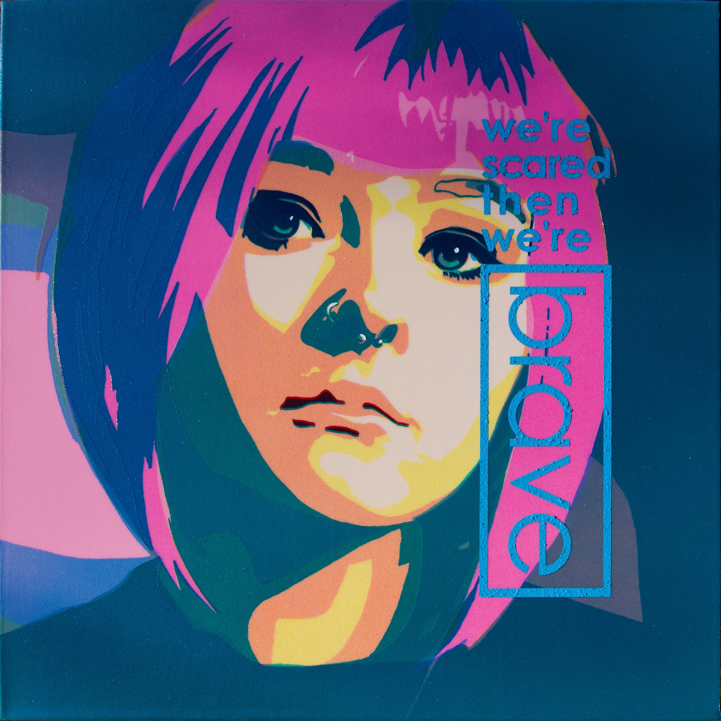
Beware Of Thoughts That Are Not Your Own-Halo
acrylic on stretched canvas
40” x 40” x 1.5” (102 x 102 x 3.8 cm)
more details
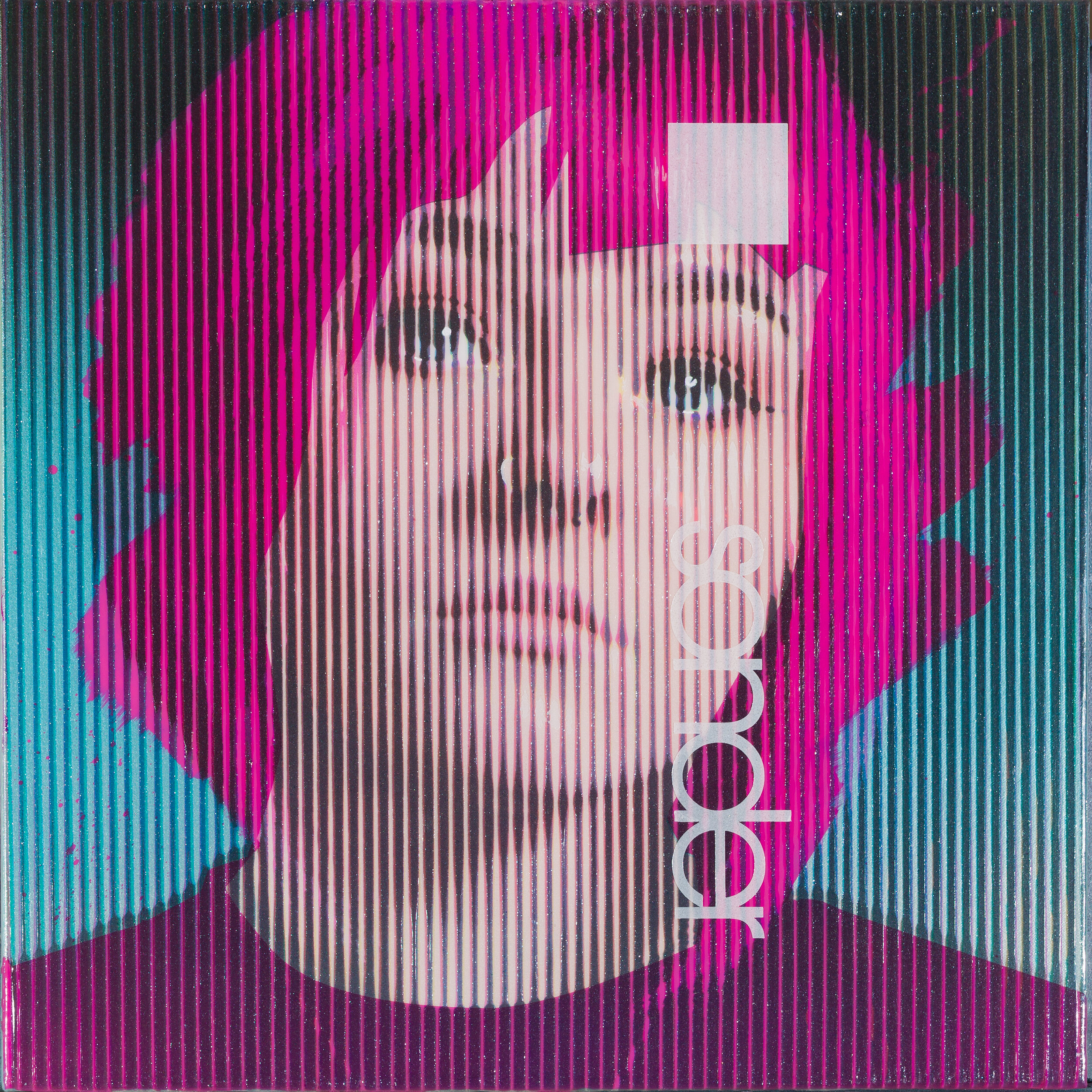
This might be a nice place to mention that with all but one very obvious exception (yet to come) these photos are folks I know or have met personally, 99.99 percent of the time I work from my own photo sources. Sometimes the person is a family member or fellow artist and sometimes they are just a cool person I met on a train, as is the case of the model for Sonder.
Sonder : is defined as "the realization that each random passerby is living a life as vivid and complex as your own".
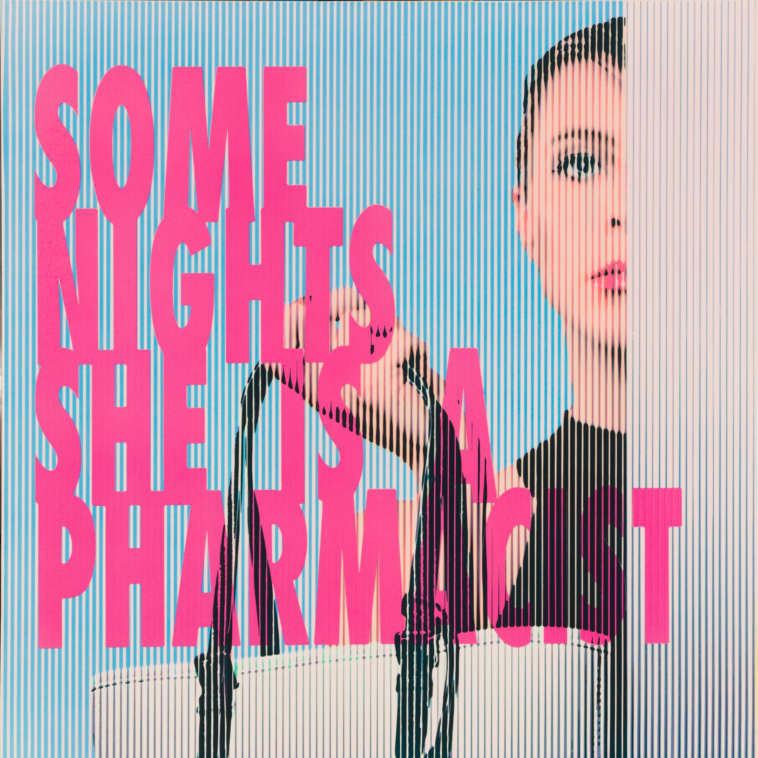
Often the music I’m listening to finds its way into the paintings I’m planning. (24”x24” on stretched canvas)
Some nights she is a pharmacist is one such piece; I heard the line, I imagined the image, and went right to painting. (40”x40” on stretched canvas )
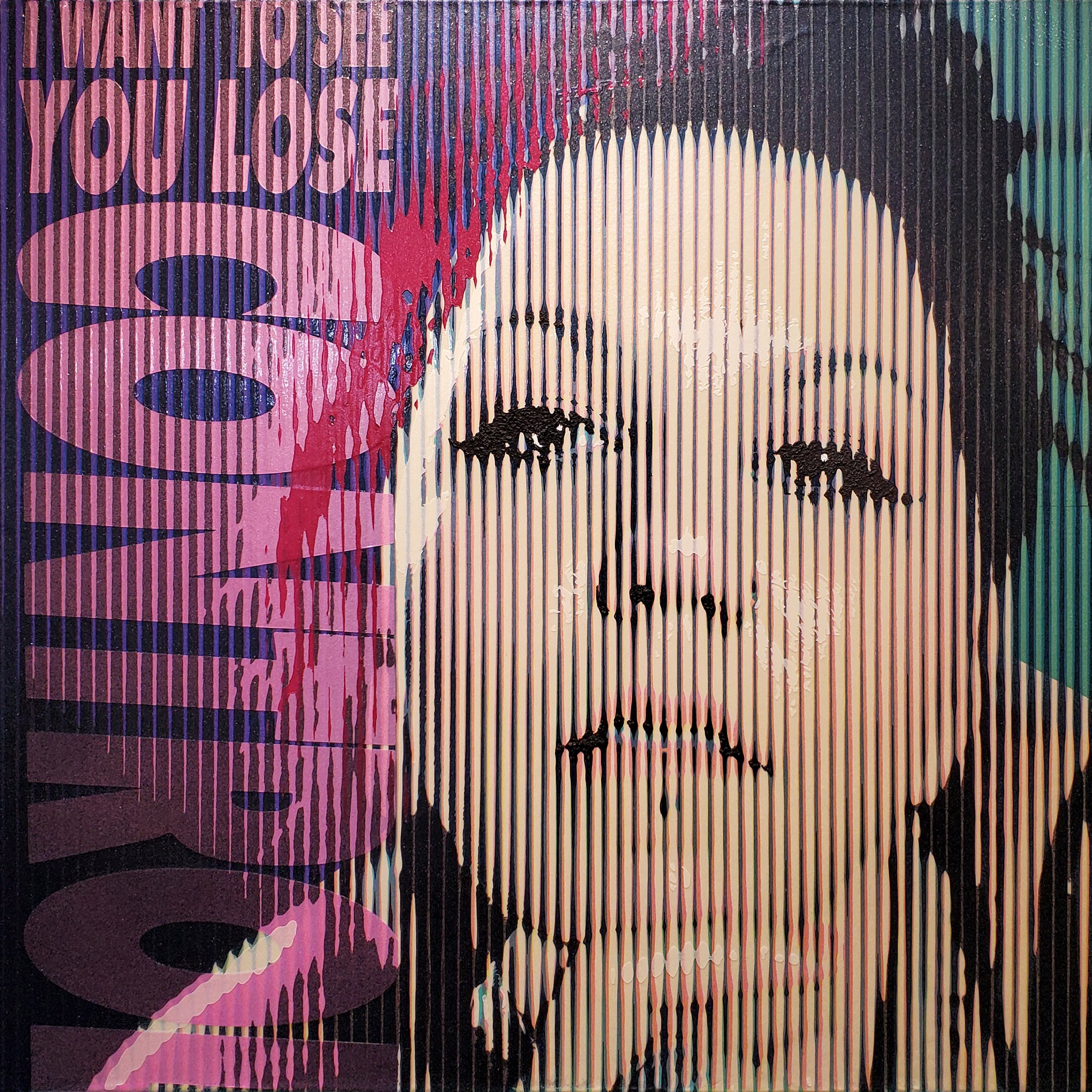
I want to see you lose control: perhaps ironically is loaded with pearls, flakes, candies, and silica. It is a piece that took a ton of control to make and at the same time the expression of my friend here, just seemed to be softly pushing and daring to enjoy the moment of a loosened grip. (24”x24” on stretched canvas)

These pieces are a few that search for “what would a graphic artist fine art’s work look like”, but, of course, also again navigating life as an introspective human in perhaps the loudest moment in human history.
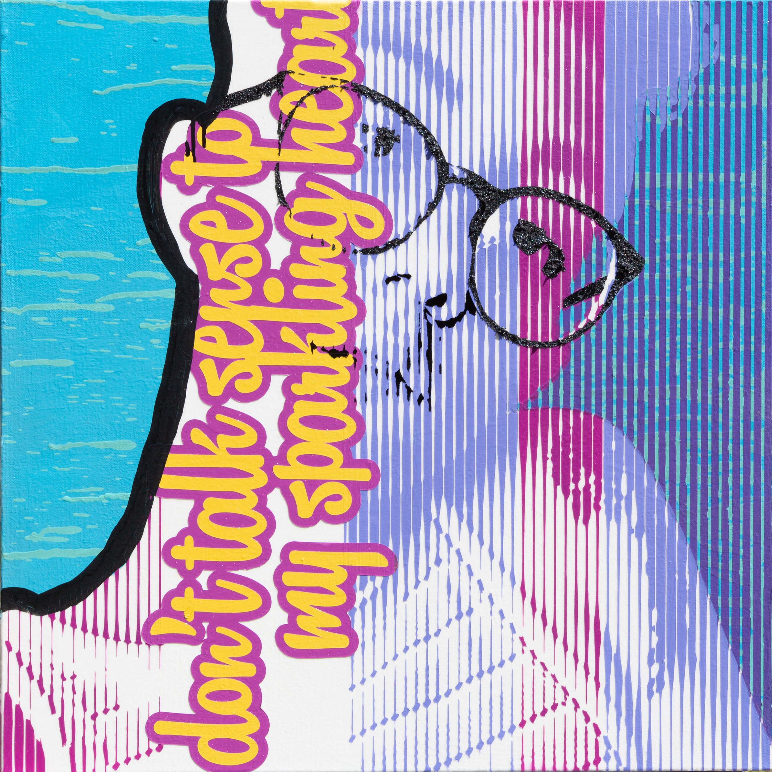
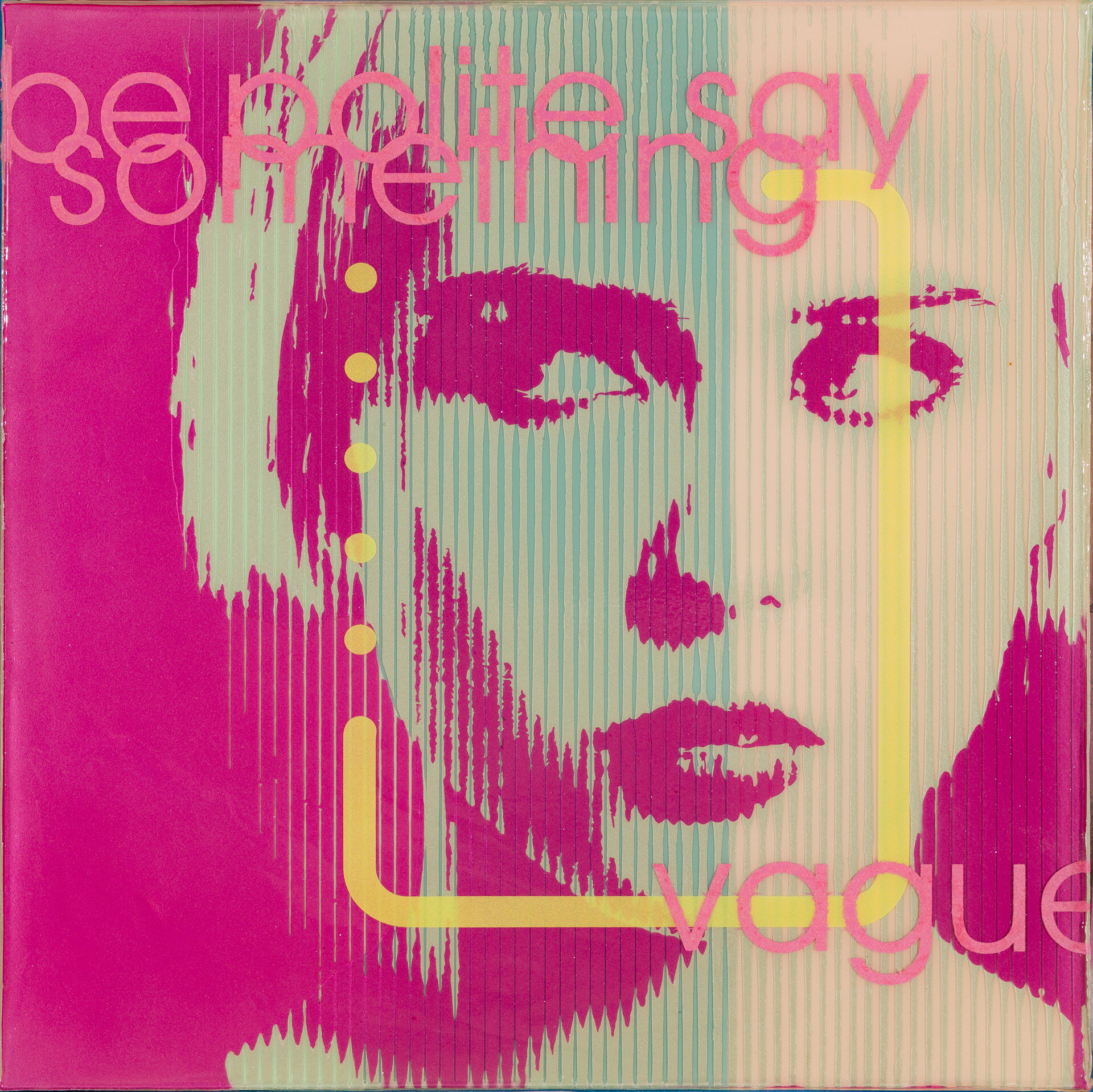
Be Polite, Say Something Vague: is a fun one with its flakes only visible through thick, lifted but narrow slits of pearl paints and topped with a layer of flocking to make the lettering. If you’re not familiar with flocking, think fuzzy insides of jewelry boxes. (24”x24” on cradled board )
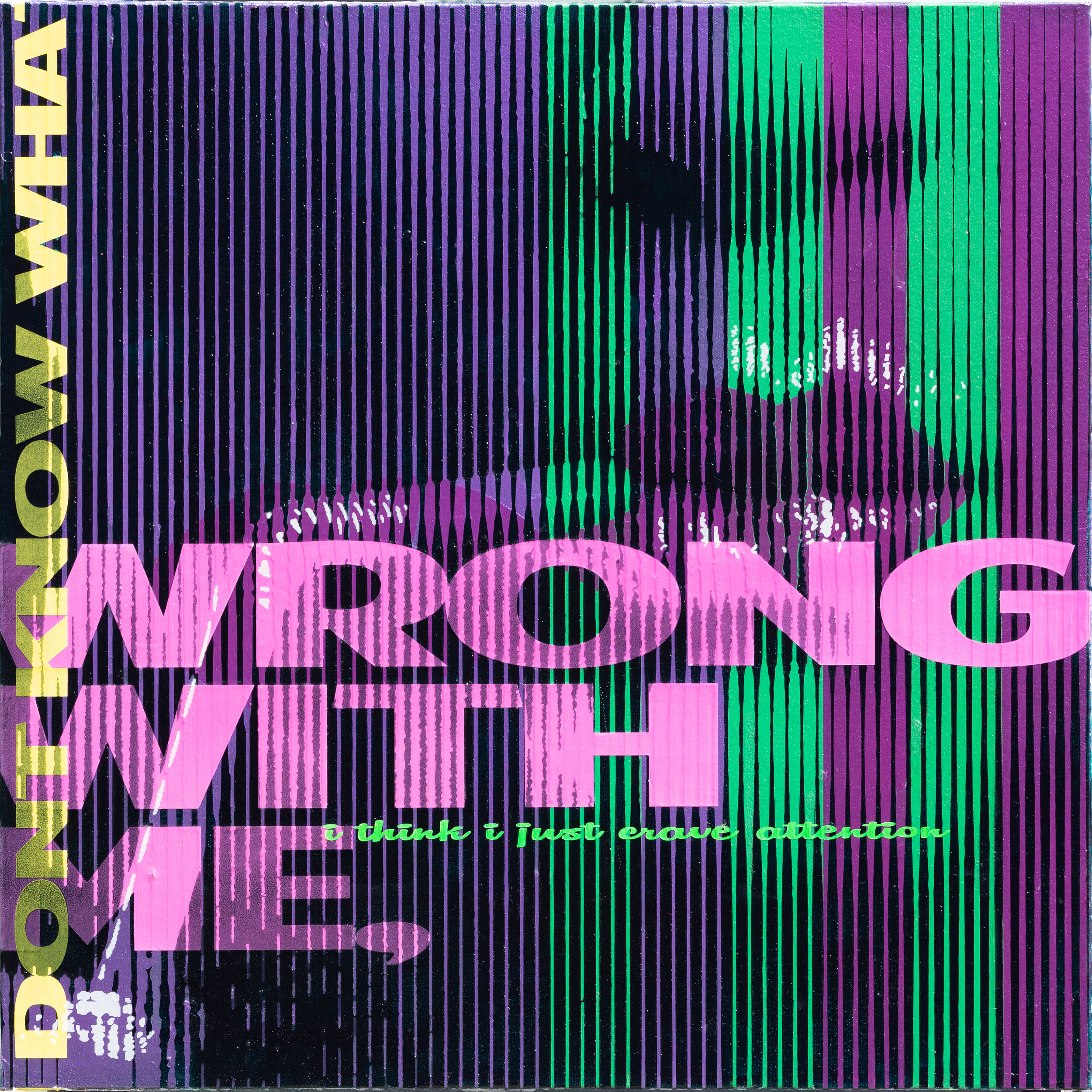
I Don't Know What's Wrong With Me (i think that i just crave attention): somehow i think that the title says it all. Again, in real life, the finish of the paint with the pearl is a ton of fun. (24”x24” on stretched canvas)
THAT STYLE: is 40x40 on stretched canvas, with silver paint, gold leaf, red and purple candies it has a super luxury feel in finish and design. And with all that happening the dark lines of the red candies are laden with silica giving the texture of rough asphalt. I love the contrast of ideas / texture and finish on this. (40”x40” on stretched canvas)
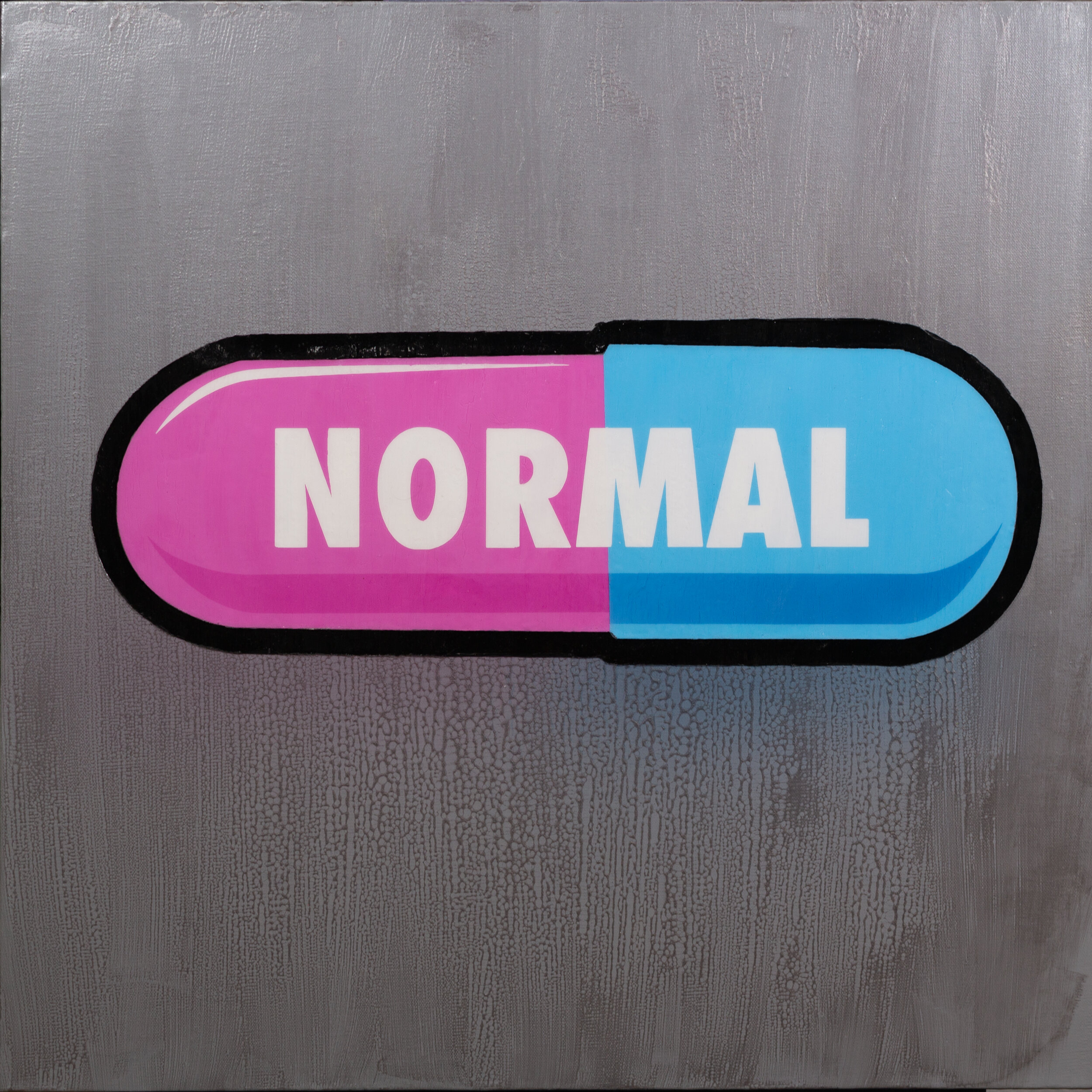
NORMAL: has a graphic that is painted so thick it seems to float above the silver textured background. (24”x24” on stretched canvas)
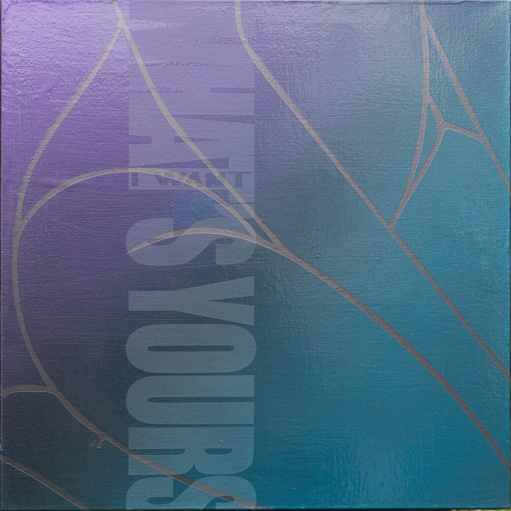
I WANT WHAT’S YOURS: is me looking at the figure and breaking it down in a different way than most of my other work but still pushing it to abstraction. i wanted to talk as quiet as i could about a couple ideas in both design and changing social norms (24”x24” on stretched canvas)
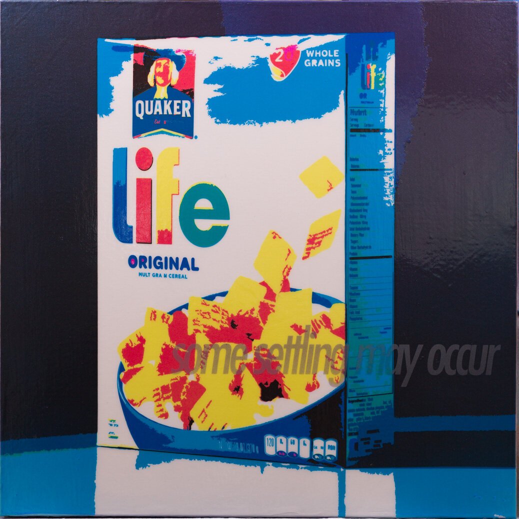
SOME SETTLING MAY OCCUR: once again, like all the work at varying levels, photography doesn’t really tell you the story of this piece. This whole painting has a glowing sheen of candied paint over a reflective base that is a treat to invite the viewer to look a little closer while the metaphor slowly creeps in. (24”x24” on stretched canvas)
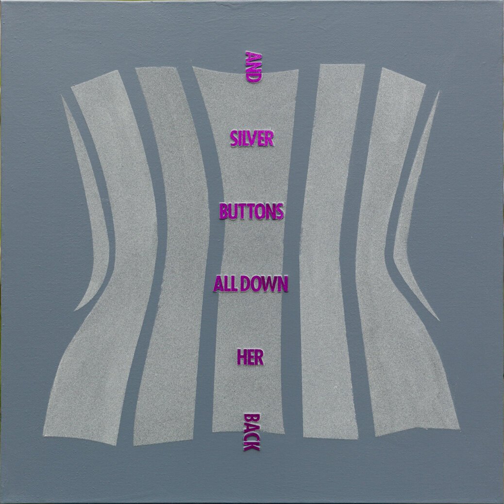
AND SILVER BUTTONS ALL DOWN HER BACK: was a goal to once again abstract the figure, this time as if Saul Bass had painted it. And then to make the render interesting to me and my material fetish I used flocking for the shape of the corsets and the letters were created by cutting thin sheets of aluminum, stacking and painting them with a purple candy. Are you reciting the nursery rhyme yet? (24”x24” on stretched canvas)
Last but not least is Elvis: this is the one piece in the show that uses someone else’s image as source, and is my nod to Andy Warhol’s and Jeff Koons’ Elvis pieces. It’s built on an aluminum and pearl white painted base and then I sprayed broken glass on the figures before coating super thick layers of resin and transparent vinyl. (32” x 20” x 2” on cradled board )
Ok, guys, that is what I’m showing for “an uncomfortable conversation” at 116 Gallery in St Charles .
Every image is clickable for more detailed photos, material and size info and some even have some short videos :) ! I hope you decide to come out and see the show in person even if you are a little uncomfortable :) . If you aren’t in the area and are looking to purchase one of these artworks please reach out.